Graphic Design With Accessibility in Mind
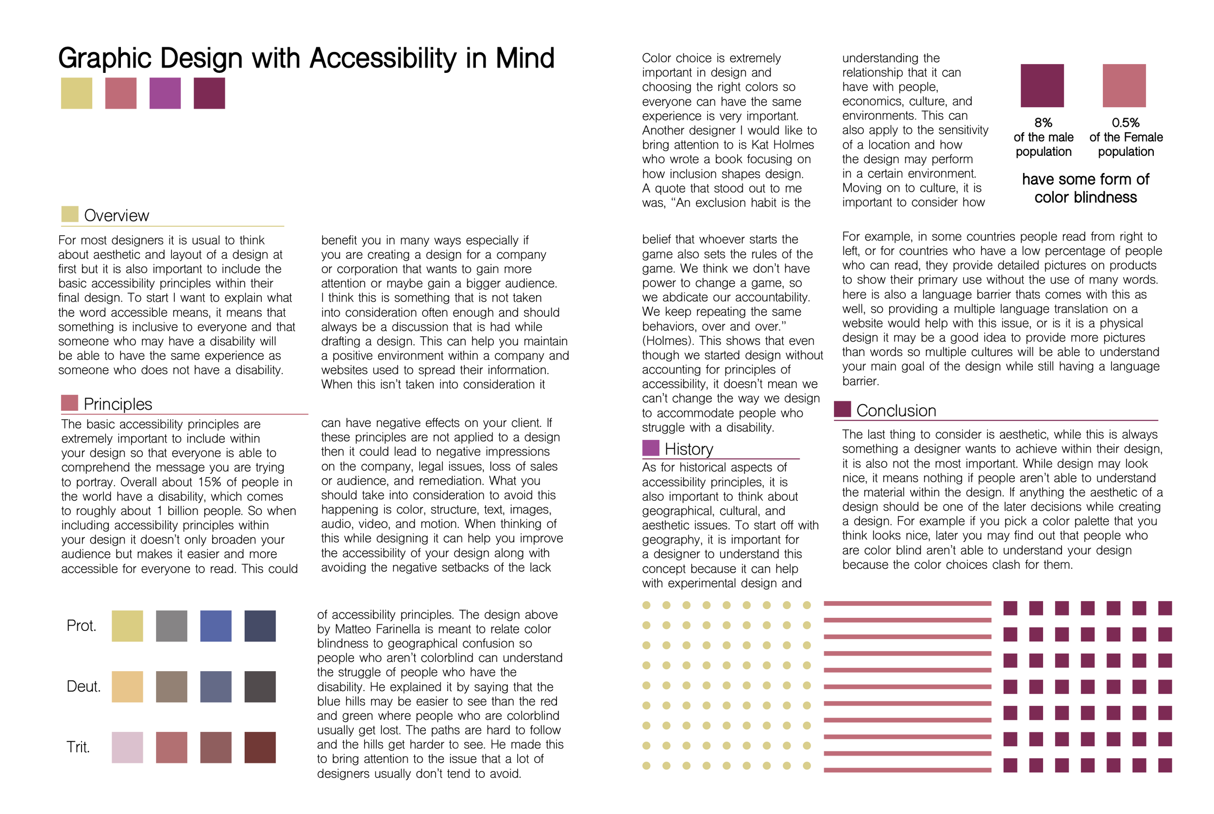
For this project, I created a magazine spread and article focused on accessible design, specifically for individuals with color blindness. My article explores how thoughtful color choices can improve accessibility. The design features a color-blind-friendly palette, a visual simulation of how different types of color blindness affect perception, and an example of using patterns as an alternative for conveying information. I used a clean, effective layout to ensure clarity while reinforcing the theme of inclusivity in design.

